Landing Page: The Secret Formula to Double Your Sales!
Every day, thousands of people run ads on Facebook, Google, and Instagram. But does everyone succeed? No.
Many businesses put out great content and still don’t get the sales they expect. Why? Because they often ignore one key element — the Landing Page.
In this guide, you’ll discover: ✅ What a landing page is ✅ Why it helps increase sales ✅ How it can double your conversions ✅ And how you can easily create one yourself
🎯 What Exactly Is a Landing Page?
A landing page is a single webpage where a visitor lands after clicking your ad or social media post. Unlike your main website, this page is built for one clear goal — like selling a product, collecting sign-ups, or getting form submissions.
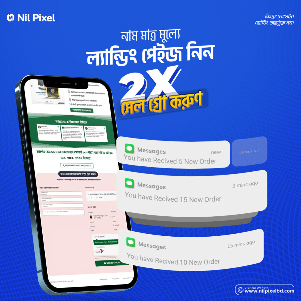
Example: Say you’re running a Facebook ad for momos: “Buy 1 Get 1 Free!” If someone clicks on the ad and lands on your homepage, they might get confused. Too many products, categories, and information can distract them.
But if they land on a dedicated page that shows only the momo offer — with a picture, price, and order button — they’re much more likely to buy.
🧠 Why a Landing Page Helps Increase Sales
Focuses on one action: It guides your visitor toward one specific action — buy, book, or register. Less confusion = more conversions.
Grabs attention: Clear design, catchy headlines, and a bold CTA (Call to Action) help visitors decide faster.
Builds trust: When you add reviews, testimonials, or trust badges, it becomes easier for the customer to believe in your offer.
Loads faster: Homepages are often heavy. A landing page is light and quick to load — especially important for mobile users.
📈 How a Landing Page Can Double Your Sales
Let’s take a real-world example.
Fahim runs a skincare brand. He ran Facebook ads for a month — got decent traffic, but low sales. Later, he realized he was sending all visitors to his homepage. Too many products, no focused offer, and no customer reviews.
So he created a landing page that showed: ✔ A single offer for “Glow Serum” ✔ Discounts, customer results, and clear pricing ✔ One simple button: “Order Now”
The next month? His sales doubled. Why? Because the landing page guided people clearly — no distractions, no confusion.
🛠️ What Makes a Great Landing Page?
Strong headline: Example: “Clear Skin in Just 7 Days – Start Now!”
Subheadline: Explain the offer or benefit in simple words.
Clear product or service info Don’t overcomplicate. Be direct.
Visuals (images or video): People believe what they see.
Customer reviews or results: Real feedback builds confidence.
CTA button: Use bold, visible text like “Buy Now”, “Register”, or “Try the Demo”.
Trust signals: Things like SSL badge, refund policy, or Bkash number add security.
💡 Simple Tricks That Boost Sales
Put the offer at the top: Show the deal before the visitor scrolls.
Create urgency: Use lines like “Only 10 left” or “Offer ends tonight at 12”.
Make it mobile-friendly: Most people visit from phones — design for small screens.
Speed matters: If your page takes more than 3 seconds to load, people may leave.
🤖 Can You Run Ads Without a Landing Page?
Yes — but it’s like fighting a battle without armor.
Even if your ad is excellent, if people click and land on a page that doesn’t match their intent, they’ll leave. Each of those clicks costs you money — so no conversion means money wasted.
💰 Tips for Business Owners Relying on Facebook/Instagram Ads
Create a separate landing page for every campaign Example: one for “Winter Offer”, another for “Buy 1 Get 1”.
Always track conversions Know which page is bringing in sales — improve the ones that aren’t.
Understand the customer journey Put yourself in their shoes. What are they thinking after they click? That’s how you optimize a page.
🧪 How to Easily Create a Landing Page in Bangladesh
Design in Canva, then build using Webflow or Framer
Use WordPress + Elementor
For simple setups, try Google Sites or Carrd.co
Hire an agency or freelancer if you’re short on time
✅ Final Thought — A Good Landing Page Isn’t Magic, But You Can’t Do Magic Without It
If you truly want to increase sales online, running ads isn’t enough. The destination of the ad — your landing page — must be ready.
A good landing page doesn’t just attract visitors. It turns them into customers.
📌 Build a simple one today — and see the difference for yourself.